I'm an art director for DTC performance brands. My job is to take a strategic angle and translate it into a visual decision (the hierarchy, the framework, the composition) that earns attention in the feed before anyone reads a word.
I'm André Vega. Ten years as a creative and art director across multiple disciplines (branding, editorial, advertising), with the most recent chapter focused on DTC performance creative for paid social: supplements, skincare, wellness, fitness, lifestyle. My day job is Design Lead at a Canadian performance agency, doing art direction and design ops for a pod that ships at volume, working alongside in-house strategists and copywriters.
On my own projects I run the full loop. I have a personal research pipeline (mining reviews, comments and customer feedback for the exact Voice-of-Customer signals worth turning into ads) and I use it to feed my own concepts end-to-end. So I can plug in as an Art Director inside a team, or as a Creative Strategist + AD when there isn't one.
What stays the same in both setups: I treat art direction as the act of translating a clear strategic angle into a visual decision the feed can read in half a second. The aesthetic is the byproduct, never the brief.
Whether the angle comes from a strategist on the team or from my own VoC research on a solo project, the direction work runs the same way: five decisions, in sequence, that turn a written angle into a finished ad fast enough to keep up with a performance team.
Before anything else: what's the actual tension this ad is trying to dramatize? I make sure I understand the strategist's intent, not just the copy lines.
Every angle has a visual structure that fits it best: comparison, problem/solution, social proof, isolated hook. The choice happens before I touch the canvas.
Where does the eye land first, second, third? What's a one-second read versus a three-second read? Hierarchy is the most underrated tool in the feed.
Composition, typography, color, treatment. This is where craft shows up: turning the structure into something a thumb actually stops scrolling for.
I hand off, watch what performs, and feed that signal back into the next round. The work that converts teaches the work that comes after it.
Over ten years I've kept returning to the same six visual structures (the ones that consistently earn a second of attention in the feed). Each has its own signature, its own typographic logic, its own use case. Picking the right one is half the art direction.
Split-screen contrast structure with color-coded superiority signals. Checks vs crosses. Fast scan-comparison for competitive positioning.
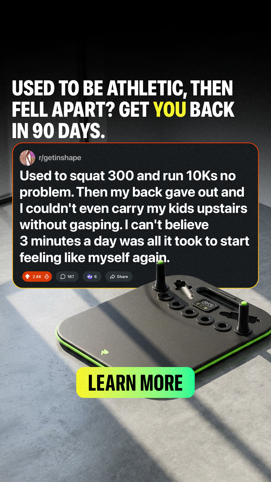
Emotional hook that names the user's frustration, then presents the product as the hero. Social proof badges seal the deal.
Central product with dynamic bullet points connecting features to benefits. High-contrast CTA inside the safe zone.
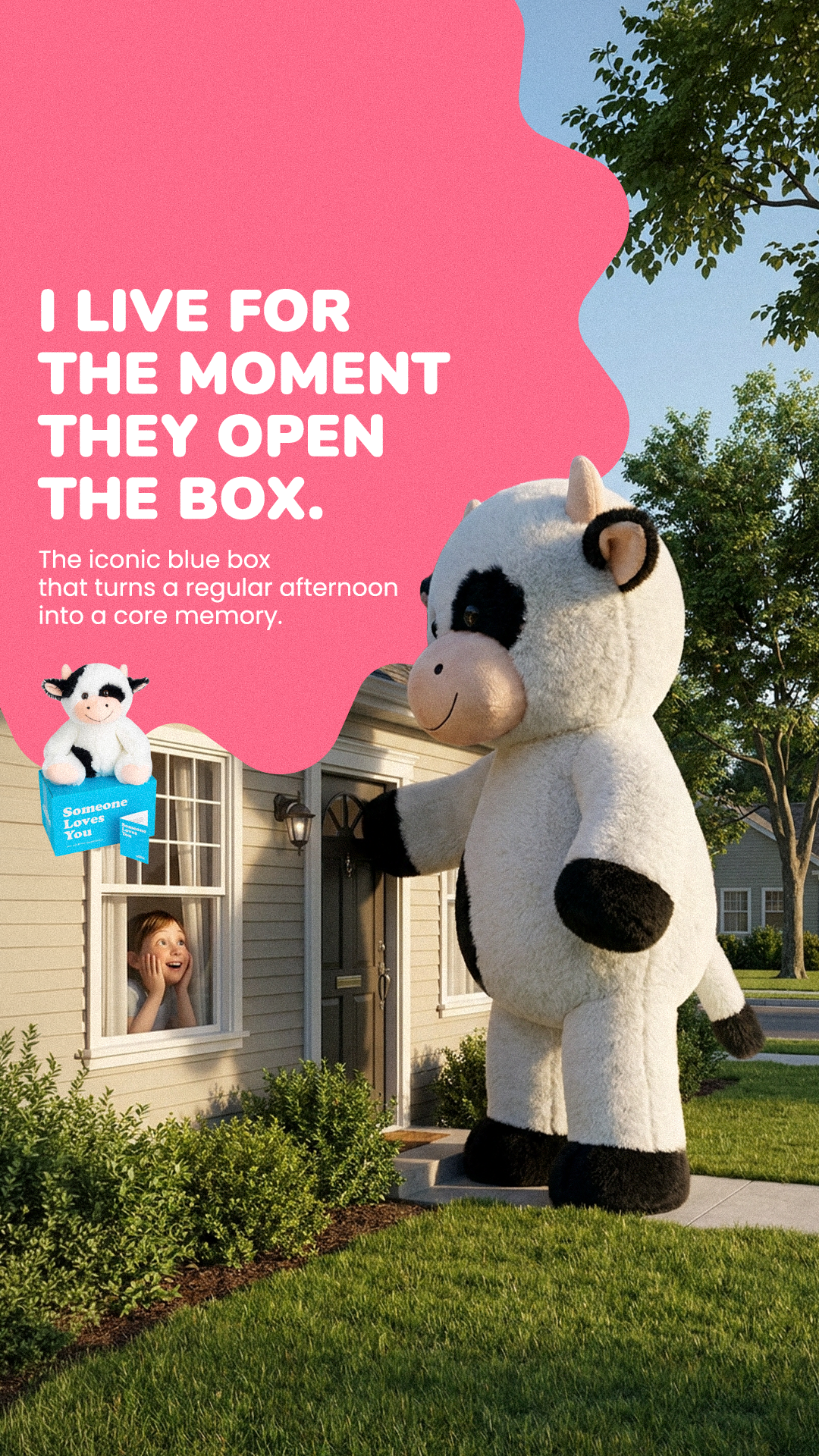
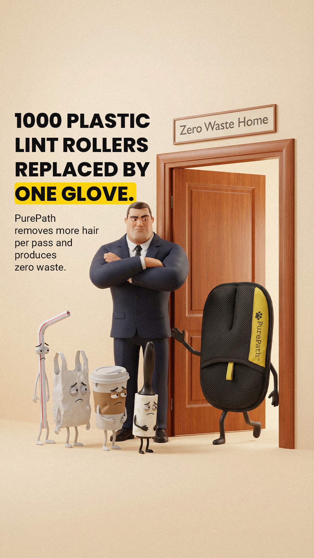
Minimalist structure: product as visual lead with generative backgrounds. Minimal text, maximum impact. Pure branding power.
Star ratings, real comment overlays, authority badges, user counters. Converts skeptical users through wisdom of the crowd.
Founder photo with product, handwritten-style annotations. Humanizes the brand. Exceptional in health and supplement verticals.
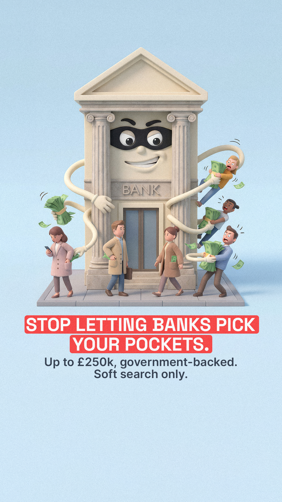
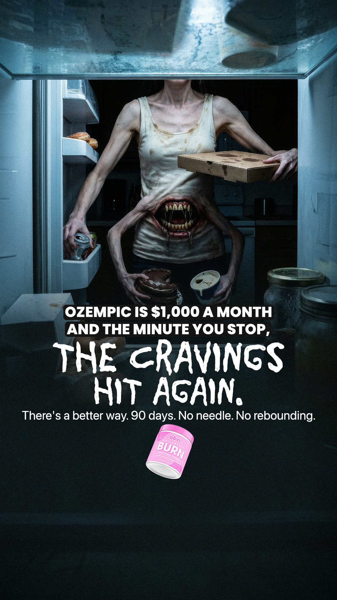
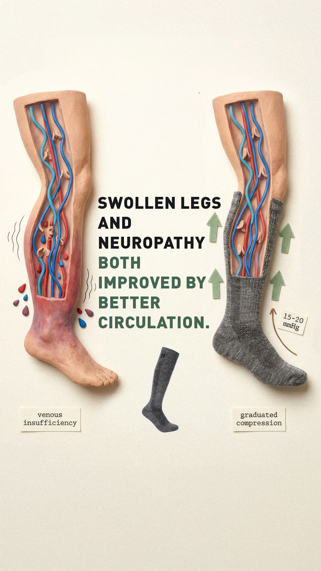
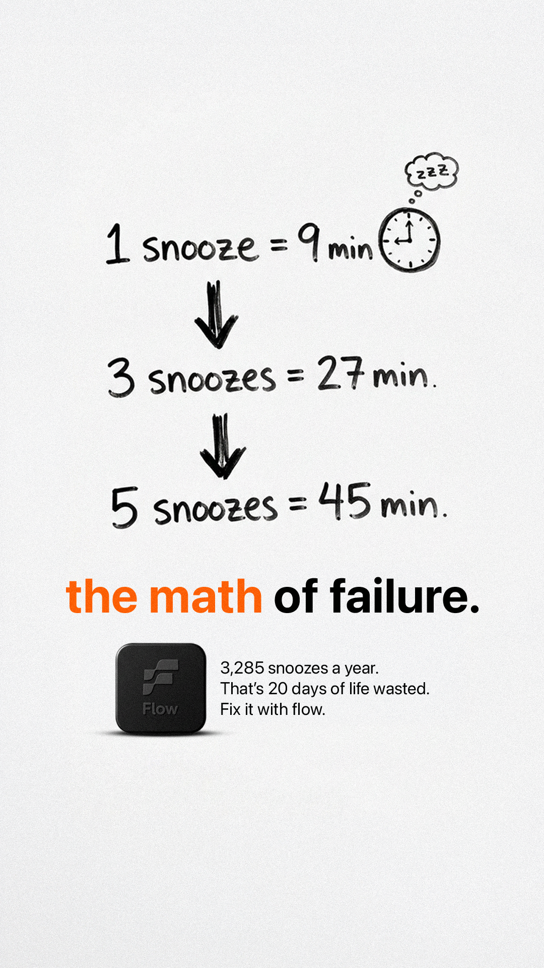
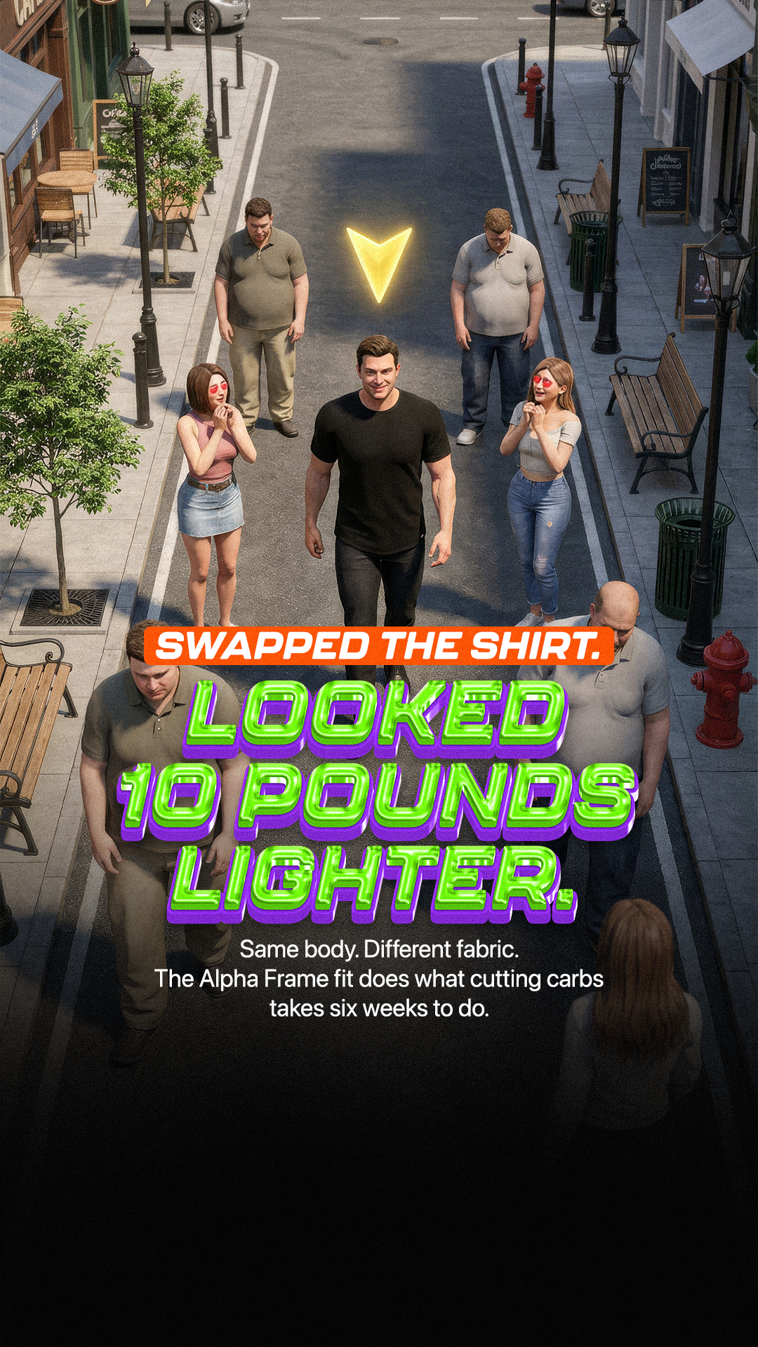
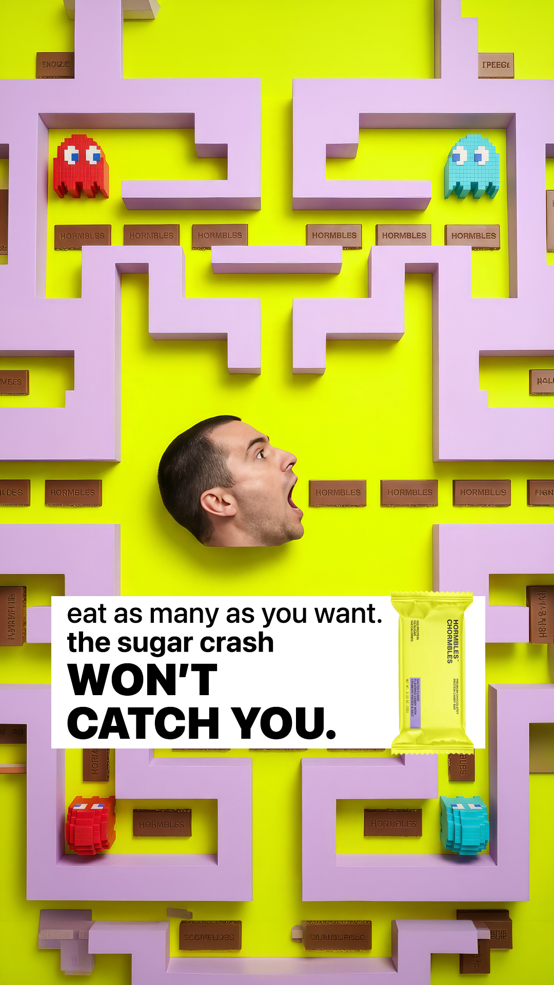
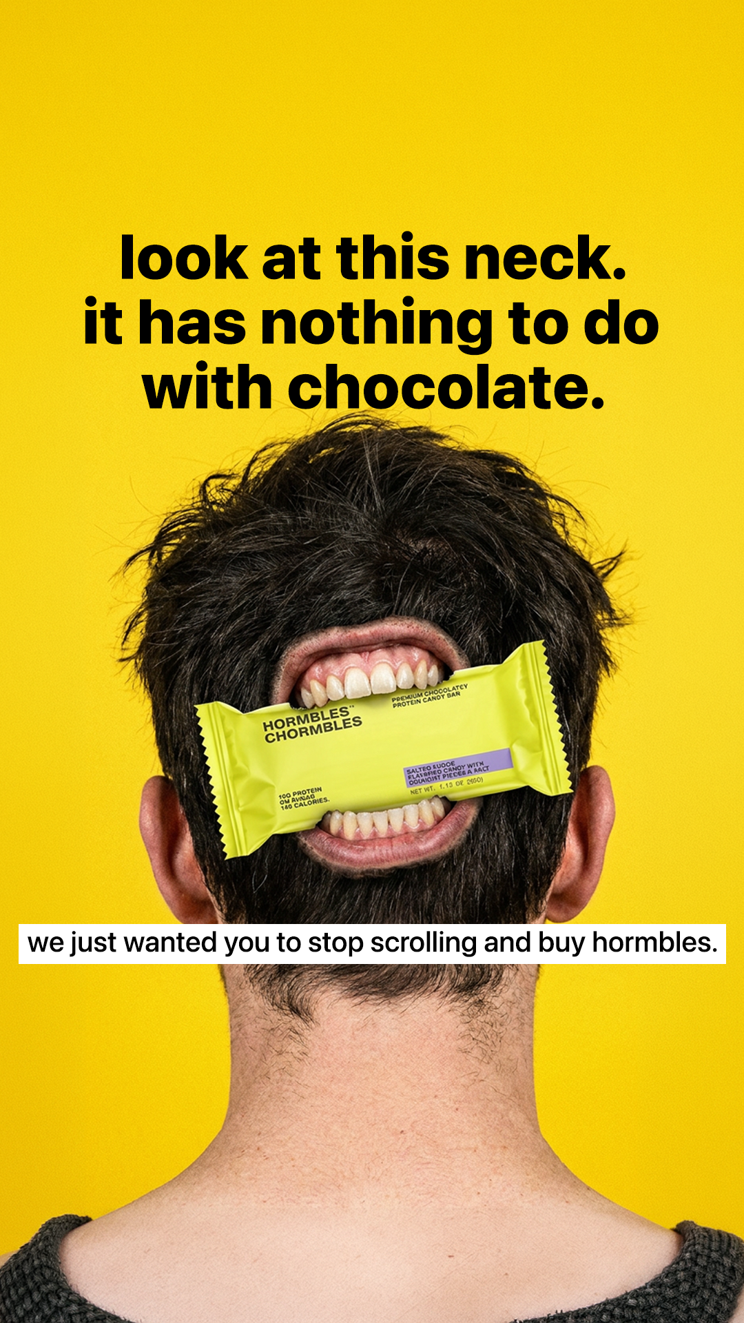
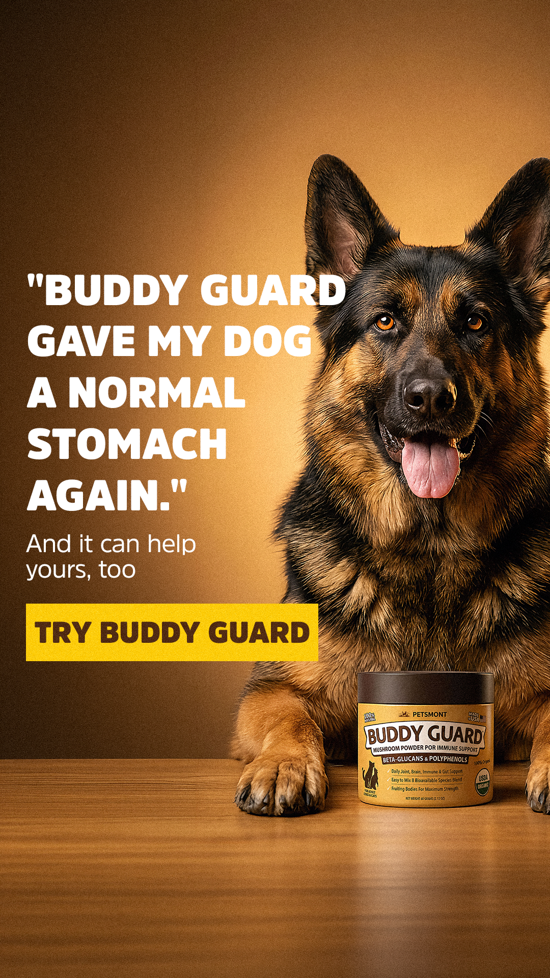
A selection of static and video ads I concepted and art-directed for DTC brands across supplements, wellness, fitness, finance, lifestyle and pet care. Every piece started in a research doc before it became a file.


The algorithm uses the ad itself to find the audience. The hook, the hierarchy, the first frame: that's the targeting signal. My job as AD is to make that signal sharp enough to be unmistakable.
I won't open Photoshop until I understand the tension the ad is trying to dramatize. If I can't say the idea out loud in one sentence, no amount of craft is going to rescue it.
"Looks good" is a side effect of clear thinking. If the angle is right and the hierarchy is right, the aesthetic falls into place. Pretty without a point is just decoration.
I can move from concept to finished file in roughly 30 minutes because I've removed every guess from the process, not because I'm rushing. Velocity comes from clarity, not from cutting corners.
My day job is leading a small creative pod inside a Canadian performance agency. So beyond directing my own concepts, I've learned to build the operating layer that lets a team produce consistent, research-driven work without losing quality. If you need it, it's available. If you just need an AD, that's the default.
I run direction, framework choice and QA for a small pod of designers, keeping the creative voice consistent across high-volume output.
Intake briefs, framework catalog, async QA: light scaffolding that protects craft while letting the team move fast.
I document the visual logic so new designers reach full velocity in 2–4 weeks instead of shadowing for a quarter.
I'm open to art direction and creative strategist roles with DTC brands and performance teams (full-time, contract or project-based). If your creative needs to convert in the feed, let's talk.
Connect on LinkedIn